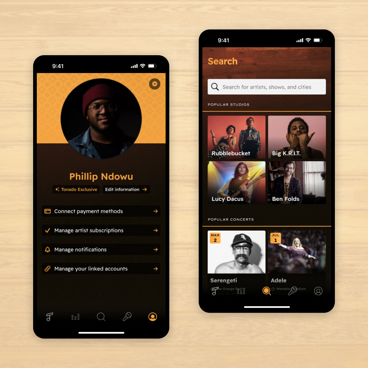
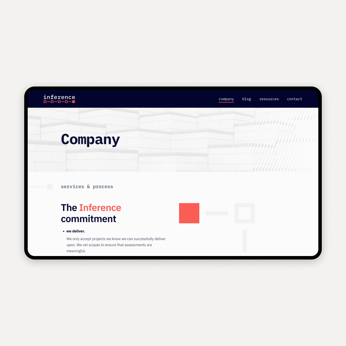
RevBoss, a Durham-based sales prospecting company, approached us with the goal of refreshing its brand identity and redesigning its website. RevBoss’s brand had remained relatively unchanged since the company’s inception as a start-up, and by their own admission, the brand identity was too one-dimensional, heavily reliant on its primary orange brand color. No longer a start-up, RevBoss was seeking an updated brand identity that reflected the maturity of the company and the sophistication of its product.
RevBoss
Elevating a Growing SaaS Brand

THE CHALLENGE
RevBoss had experienced tremendous growth since the company was founded and was looking to elevate its brand identity and align it better with its growing position in the marketplace. They were also seeking a more simplified and repeatable approach to creating and maintaining website content to further fuel their growth.
OUR APPROACH
We identified elements of the RevBoss brand that needed a refresh, documented how the company's leaders wanted to position it within the competitive landscape, and refined who they wanted to speak to. Leveraging these insights and vision, we produced an updated brand kit that served as the foundation for a sophisticated new website design. We then brought that new design to life in WordPress with a component-based editor experience to allow for the creation of flexible and customizable new pages.
THE RESULTS
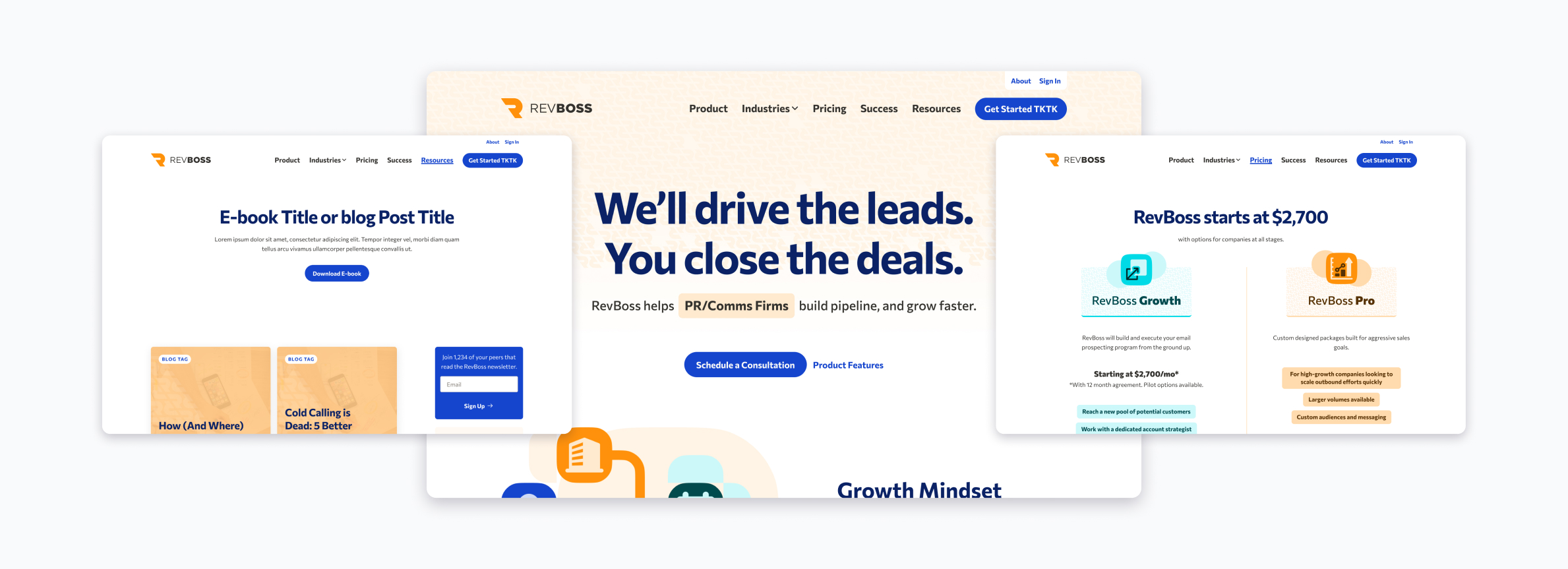
A new, elevated brand identity that aligns with RevBoss’s current and future position in the market. An updated, editor-friendly site allows RevBoss to easily manage its website content and customize pages with flexible, reusable components. With newly established guidelines and a design system, RevBoss now has a sophisticated identity that can be consistently reproduced regardless of the medium.
Elevating a brand as it grows
Creating a cohesive design system
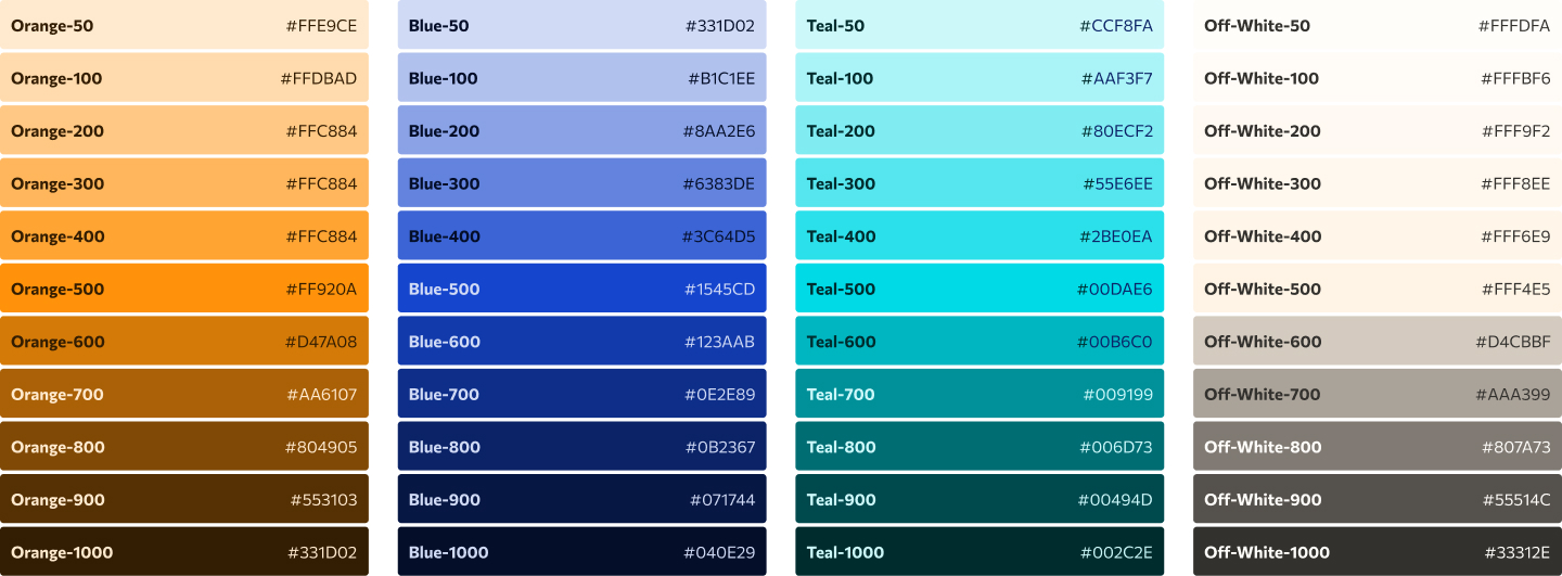
In order to refresh the brand and lean into its growth, the team at Revboss needed a comprehensive and cohesive design system. The first piece of that system we tackled was color. We defined a palette of accent colors and gradients to complement the primary brand color and reduce the reliance on orange. We made use of this expanded color palette for the new website’s headers and calls to action so that these important elements would stand out against a neutral background and a newly toned-down version of RevBoss Orange. The second piece of the system we focused on was typography. We chose Commissioner for its variance in strokes and letter construction which helps give it a sense of humanness and thus portrays RevBoss as open and relatable.
RELATED READ
Creating a Design System to Empower Our Client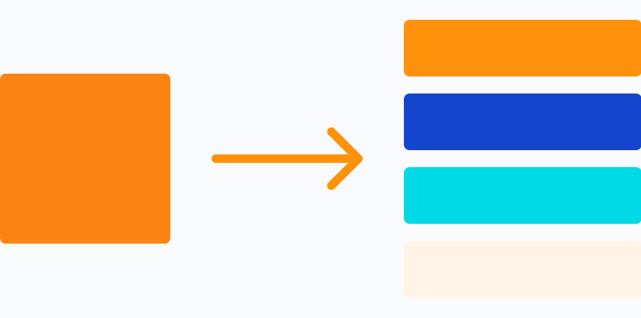
The most unique component of the new design system was the custom illustration kit we created. RevBoss wanted to avoid using cliche imagery and stock photography on their new website while taking ownership of creating illustrations so as not to rely on costly and time-consuming third-party pieces. Using Bauhaus imagery as inspiration, we leveraged Figma’s variable component feature to produce a set of design tiles with various shapes that could be moved, rotated, and customized with RevBoss’s brand colors. With this design kit, the RevBoss team can now produce sophisticated, unique graphics more efficiently.

We brought the new-look RevBoss brand to life by translating the new design system into a series of flexible components that could be leveraged across pages for improved efficiency and consistency on the website. On RevBoss’s old site, content creation was a cumbersome process that often involved duplicating existing pages and manually editing HTML and CSS to change content and achieve the desired end result for the user. When we met with RevBoss to strategize an approach for refreshing its site, having a no-code solution to easily create new pages and update content was imperative. To achieve this, we designed and built components that could handle various content types and had multiple use cases so that whether RevBoss was creating a landing page or a product feature page, they had a variety of components that were up for the task.
Using Advanced Custom Fields in WordPress, we created mechanisms and options for content creators to customize components and create the optimal page layout for the situation. For example, with conversion optimization top of mind, we created a form component that could be full-width or used in a two-column layout with supporting text and image. Want to feature a two-card component on the home page but need four cards on a product feature page? Our components offered that level of flexibility while maintaining a simple interface for content editors to input text, upload images, and utilize the RevBoss brand colors as needed.
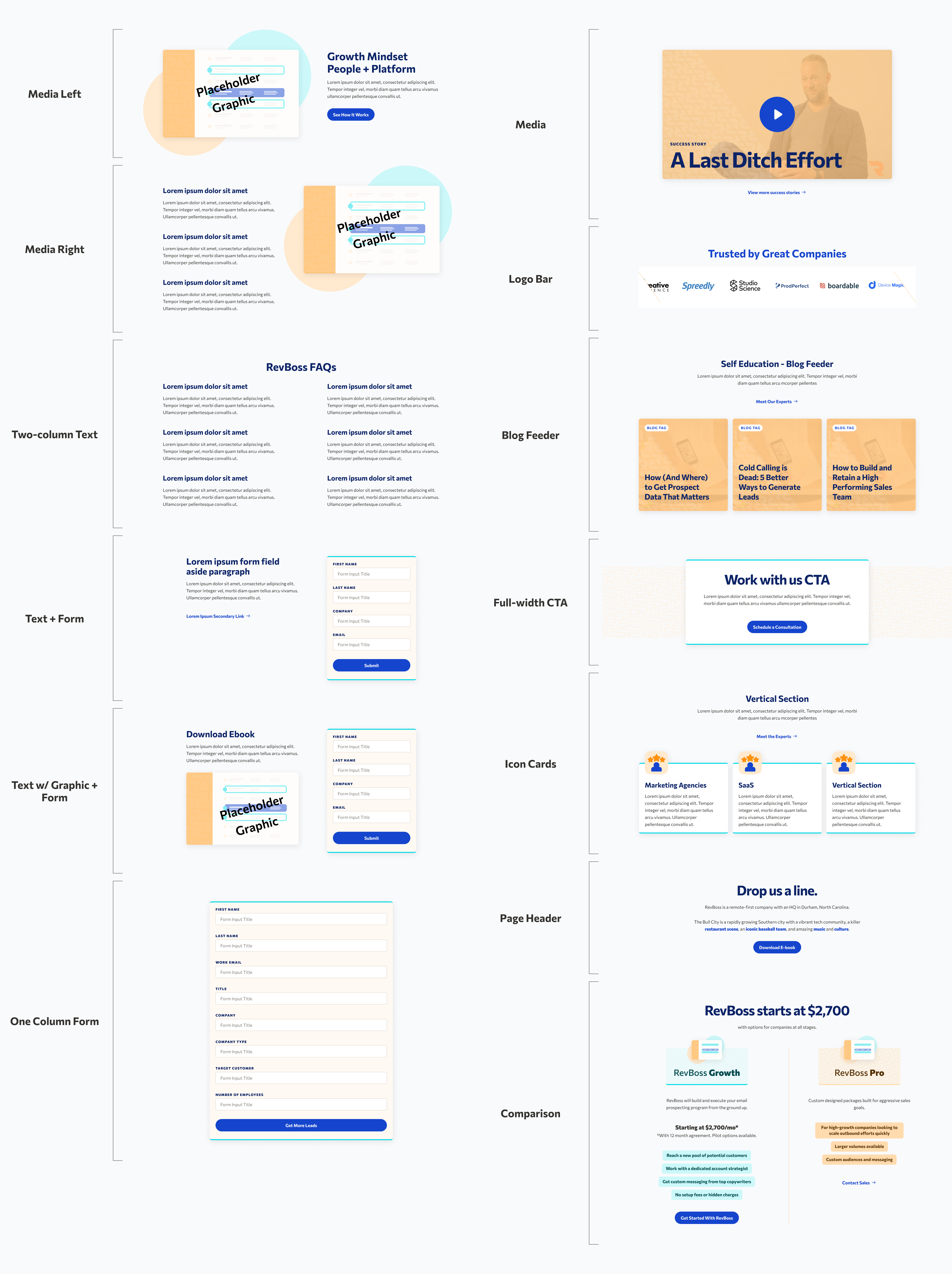
By building components with flexible options but not endless customization, we were able to ensure the consistency of the new RevBoss brand, without limiting their ability to construct unique pages across the site. The end product was a powerful and user-friendly site that allowed RevBoss to demonstrate the maturity and sophistication of both their brand and their service.
A sophisticated, yet simple solution for a growing brand
Our refresh of the RevBoss brand and website is a perfect example of how sophistication doesn’t have to mean complexity. There is elegance in simplicity and simplicity doesn’t have to mean boring. With a thoughtful design system, you can create a brand identity and website that is equal to the sophistication of an ever-evolving company.
Transform your brand
From brand development to visual identity, we ensure brand consistency across all media channels to boost audience engagement for our partners.

