The Aids Clinical Trials Group

Developing an Intuitive Navigation System for ACTG

ACTG website homepage

THE CHALLENGE 

The team at The Aids Clinical Trials Group (ACTG) looked to overhaul its web presence to more aptly echo its stature as a leading authority in HIV research and serve as a go-to resource for both participants and researchers.

OUR APPROACH 

To meet these objectives, we met with key stakeholders to discuss functionality requirements and priorities, focusing on improving the user experience and new, intuitive navigation. As a part of the visual redesign, we extended ACTG's brand toolkit by introducing new elements like a custom gradient to spotlight key content while bolstering the organization’s digital presence.

THE RESULTS 

We delivered a modern site experience with an intuitive system for users to seamlessly search and filter through trials and site locations to find relevant participation opportunities closest to them.

A leader in HIV research

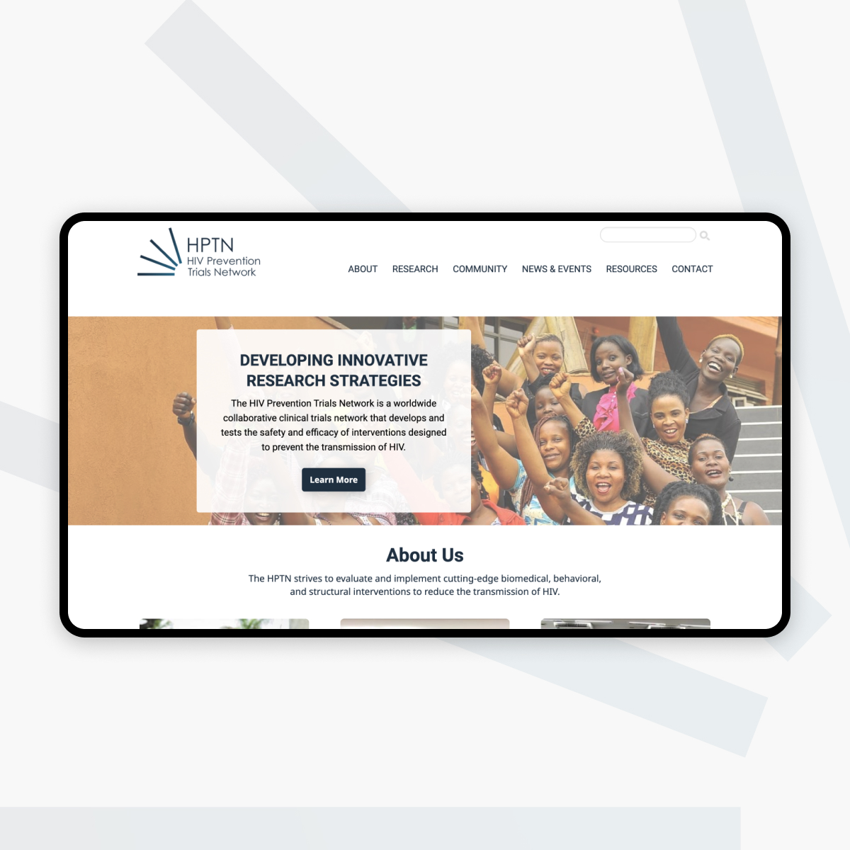
After working with the HIV Prevention Trial Network (HPTN) over the years, our client partners there referred us to The Aids Clinical Trials Group (ACTG), the world’s largest and longest-running clinical trials network focused on HIV and other infectious diseases.

To cater more effectively to their two primary audiences of participants and researchers, the ACTG team looked to redesign their website and solidify their position as the foremost authority in HIV research. Unfortunately, the former site’s navigation posed significant challenges, as participants struggled to locate trial information and site locations, while researchers often avoided it entirely.

Gathering stakeholder insights

In updating ACTG’s visual identity, we wanted to find ways in which we could thoughtfully expand upon the existing brand. To guide this effort, our strategists executed a spectrum poll involving key stakeholders to assess their preferences and gather insights. Following this meeting, the general consensus was that when juxtaposed directly, the original red and teal blue brand colors produced a harsh contrast, leading their team to lean in favor of leveraging the use of white space.

ACTG stakeholder spectrum poll results

Shaping ACTG's visual language

As we worked on the new designs for the site, our vision was to capture the credible nature of ACTG’s work and pair it with an approachable, humanized feel. To achieve this look, we ventured into a more typographic design realm, drawing upon the power of color and establishing font hierarchy, using shapes to accentuate content and pique visitor interest. 

Our most notable element addition was a custom gradient bridging the two foundational brand colors rather than using them directly. This gradient has a color-space interpolation that shifts it away from the gray and muddy tones at the midpoint of the two colors. Instead, it arcs through a purple that complements the original brand colors and softens the palette.

ACTG extended brand guidelines

Revolutionizing the navigation experience

Addressing the navigation complexities of the extensive clinical trials list became our next priority. Given that trials might span multiple locations and a location can host various trials, we needed to devise a system to help users find the information most relevant to them. During our initial deliberations with the ACTG team, we discussed solutions that included an interactive map and information table. Together we discussed which implementation would align with the users' needs, tasks, and the organization's overarching objectives.

ACTG content cards

Ultimately, we incorporated a static map visual on the homepage to showcase ACTG's global presence and paired that with a table that is both searchable and filterable, addressing potential map-related concerns on mobile platforms. This design ensures users can seamlessly switch between the two content types, enhancing the overall experience.

ACTG website pages