In relegating the scope to just their homepage and not a comprehensive design overhaul, HPTN felt it was essential to provide their users with more information on what HPTN does and how it can impact their lives. We honed our attention and effort on the user experience and content priority on the homepage while leaving the overall site architecture intact. Our approach was to tell a story to an unfamiliar user about who HPTN is, what is unique about their community, where they operate, and what kind of research they’re doing in the world.
HIV Prevention Trials Network
A Homepage Design Sprint

The Challenge
Refresh HPTN’s homepage, which hadn't been updated in four years, while keeping the design consistent with the rest of the site.
The Approach
Through stakeholder interviews, explore how HPTN priorities have changed since the initial design and better understand what content should be featured, giving it a refreshing and engaging look.
The Results
An engaging homepage that gives users a feeling of community and highlights the critical work HPTN is doing in the world.
Homepage focus
Leveraging the existing branding
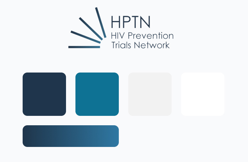
We struck a delicate balance of updating their existing brand aesthetic while ensuring it still ties into the rest of the site aesthetic. One aspect of their existing brand turned out to be a hidden gem in our design process. Within their simple logo, there was a subtle gradient design element shared between both shades of blue. We felt extended this gradient in several homepage elements such as the headers, arrows, and overlays.

It's all about community
The concept of “community” rang true as a top priority in each conversation with the HPTN team. Throughout our engagement, it became clear that it should serve as our guiding, thematic inspiration. We endeavored to make the user experience and designs exude a community feel, and our client’s felt we really hit the mark. That always feels good.
This looks great! The team did an awesome job, thanks so much!


