
It’s my passion for craftsmanship that has led me to spend the last decade studying and practicing web design. When I find examples of excellent design, I like to reverse engineer them, trying to understand precisely what it is that makes them so damn good. There are many rules and tools designers use to achieve excellence in design, not the least of which is the use of color. Proper use of color shapes the look and feel of your site while aiding in communicating your value and supporting usability. Understanding how to use colors for certain elements in deliberate and nuanced ways can go a long way in helping you craft a particularly beautiful and highly usable website.
How to Pick Colors for Your Website’s Design System
Topics
Understanding your brand's palette
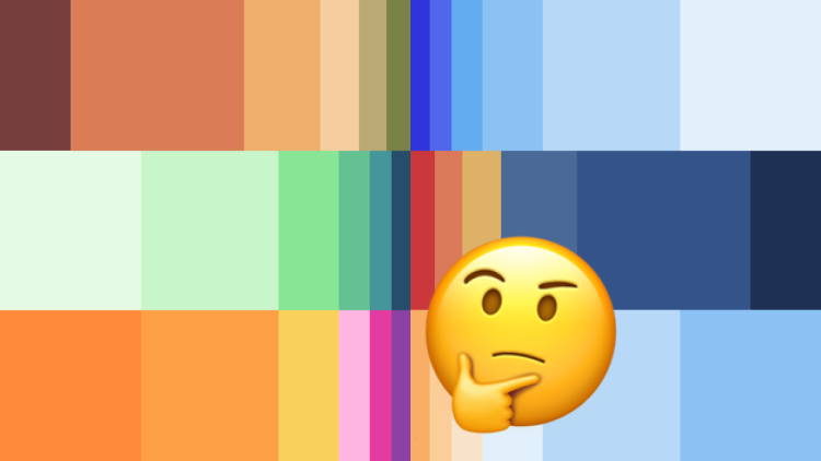
Brands put a lot of thought and effort into who they are, what they stand for, and what they’re trying to achieve. Color is just one tool we can use to support these efforts when communicating that ethos visually. A surprising amount of emotion can be conveyed simply by placing colors next to one another. For instance, take a look at the color palettes below and think about what each one represents to you:

graphic: set of color palettes: springtime colors, Halloween, muted but rich hues formal colors, candy colors, childlike primary colors
These palettes are distinctly unique, each communicating its own message. But even if you’re limited by the palette you’re working with (such as a client’s), you can make subtle adjustments in the proportion of each color to shift the overall emotional tone.
Take, for example, this palette: we have a series of grays, including black and white, with a pop of bright green and a deep forest green.
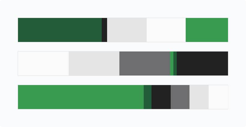
Coastal Credit Union's colors in different balances
If we set the palette to use primarily black, white, and grays with just a sliver of green, the palette feels formal and serious with a whisper of life. If we shift the palette to mostly bright green, that whisper becomes a shout and dominates the voice of the identity. That feeling of formality is still there, but the overall palette becomes much more energetic and conveys stronger feelings of growth or optimism.
When working with a client’s color palette, it’s important to understand how those colors fit into and tell the story of their ethos. Identify which are primary colors and which are accent or support colors. Furthermore, play with the balance of how much you use each one to communicate their brand voice and tone properly.
The work
Over the years, I’ve found that I tend to make the same types of choices with regard to color when designing a web identity. I’ve grouped them here into a few buckets:
- Text colors and how they’re displayed on light & dark backgrounds
- Background colors and how they direct attention and section content
- Action colors and how they communicate interactivity
- Superlights and how they delineate elements via subtlety
Remember that decisions made in these buckets are not mutually exclusive. Every decision made affects elements in every other bucket. Everything is intertwined, so have patience! You may find a decision made in one place doesn’t work in another, but through trial and error, you can learn to craft a design system that feels cohesive and polished. Be methodical, be intentional, and trust the process.
Text
Use an off-black, not pure black.
One of the first decisions I usually make is choosing a color for readable text. It’s generally considered most comfortable to read large amounts of text when presented as dark text on a white background. For this reason, I always begin by choosing what my “black” will be. I find that pure black (hex #000000) feels much too dark, like staring into the abyss. They teach you in art school that pure black is never seen in nature, so when painting real objects, we’re encouraged to mix colors to make a “black” instead of using it straight from the tube. While technically, pure black will create the highest amount of contrast against pure white; it can give a site a lifeless look when used in large fields and without consideration of other colors in the palette. It’s for this reason I always use off-blacks for my darkest shades.
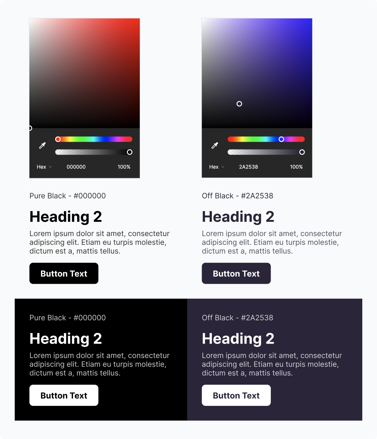
Lots of brand palettes will have black or an off-black included. In these cases, I stick to the brand guide, but oftentimes, I’ll need to choose a new one to fit the palette. When choosing an off-black, I like to find the darkest color in a brand’s palette and shift that to ALMOST black, carefully adjusting the saturation as needed. I find blues and oranges often work best for this, but it depends on the warmth/coolness of the rest of your palette. Adjusting the saturation or intensity of the color can add another layer of intention to capturing the voice. Highly saturated colors tend to feel more energetic and bold, whereas low-saturation colors feel calmer or more sophisticated. In most cases, I keep the saturation low unless a brand really calls for that intensity.
Text legibility and color contrast standards.
When choosing colors for text legibility, I’ve learned to think about it in a very simple way: you’re only ever going to have light text on a dark background OR dark text on a light background. I like to group my background colors into lights and darks, choosing a single light text color and a single dark text color to display on each of them and use those choices across the whole site. This gives me a solid base to start from as it greatly improves the sense of consistency, and I know from the get-go that my text will pass an accessibility check. There are many situations where you’ll need to shift these colors to achieve a slightly “lighter” look, but making these decisions early on gives you a solid foundation to always come back to.
Dark text on a light background
This one is dead simple. For light backgrounds, I always choose my off-black or a tint of it for text. The one exception is using the action color for inline text links.
Light text on a dark background
For dark backgrounds, anything but white or tints of the background color tends to look strange. I often stick to pure white and lower the opacity as needed to achieve this effect, updating the hex code to match once I’m satisfied.
Exceptions
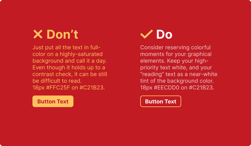
If a design calls for a more playful piece of typography — say, in a callout or as a heading — I’ll use a more saturated color for text, but only sparingly! In this situation, the text becomes a graphic device and acts as a visual flair. A big block of colorful text is often garish and unsightly, so you’ll want to be very thoughtful here. In this case, you should rely on your knowledge of color theory to pick the right color. I find complementary colors tend to work well in these situations, but this is by no means a rule. The most critical aspects to consider here are that it passes accessibility standards and that it supports your intended voice & tone. Pulling hues from a brand’s accent colors is a great place to start.
Backgrounds
Web page backgrounds are typically large fields of color, so I like to think about the purpose of the content when choosing a background color. In addition to keeping them grouped into lights and darks, I’ll think about using accent colors to add significant emphasis or variety to a page. This is where the idea of Utility vs. Marketing content comes into play.
Nielsen Norman Group talks about this user behavior in a broader sense: a user is either seeking information they need (a pull), or we’re trying to get them to look at the information we want them to see (a push). Background colors are one way we visually differentiate between these behaviors. Utility or Pull content is often designed to be easy to scan and parse and is often presented with minimal flashiness. On the other hand, Marketing or Push content is designed to be eye-catching: bright colors, loud typography, images of happy faces, etc.
I like to choose a variety of background color options to support flexibility for both types of content, relying mostly on the lights for areas of longer-form reading text, darks for stark contrast and variety, and brighter accent colors for that visual punch.
Action
Something I’ve begun to appreciate over the years is a very clear and well-thought-out site theme. The best themes always include a “primary” color or what I like to call an Action color. This hue is significantly different from all the others on your site. It is bright enough to be legible on dark backgrounds but dark enough to be legible on light backgrounds. It’s usually the most intense color, used exclusively in places where a user can take an action. The point is to establish that connection within the mental model of the user so that when they encounter an item with this color, they will know for certain whether or not they can interact with it. I reserve this color for buttons, inline links, and hover states. In many cases, the action color is synonymous with the primary brand color, but it doesn’t have to be. Furthermore, you don’t always need to use a dedicated action color, but I find that sites feel much more polished when they do.

Superlights
Superlights are fascinating to me. These are colors that are chosen in direct relation to neighboring elements that are almost imperceptibly close in hue and value but are just different enough that your brain perceives them subconsciously. Superlights are used as an extremely subtle yet entirely necessary way to separate and define areas of content without significantly impacting the look and feel. Some examples include horizontal dividers, vertical pipes between text links, the outlines on form fields, and the backgrounds of content cards.
Choosing superlights can be a difficult and finicky process, and I could spend hours tweaking them to be consistent and exact. Like with most things in a design system, you want as few of them as possible to maximize consistency and cohesion. In most cases, they’ll be relative to your background color, so choose them as needed and check them in other situations to see if the pattern holds up.
Final thoughts
The strategic use of color is instrumental in design for establishing a clear hierarchy, emphasizing crucial elements, and maintaining legibility in compliance with accessibility standards. However, achieving a successful design system extends beyond mere color selection. It involves the thoughtful application of chosen colors in a restrained and fitting manner to guide users effortlessly through your application or website while aligning with your brand's established guidelines. At Savas Labs, we specialize in creating these comprehensive guidelines and rules, empowering our clients as content creators to seamlessly expand and evolve their brand or website after the project hand-off.
And finally, if you have any questions about this blog post or have a branding project in mind, please feel free to reach out!