

We have all experienced an interface or design update of an application or site we use frequently. It usually results initially in frustration for some, and maybe a critical tweet follows for others if they are so inclined. Eventually, we all get used to it over time and move on. This experience happened very recently with our Savas team, sparked by the newly designed Google suite of icons. The result was an engaging internal discussion about cognitive load. We thought we’d share some of the finer points of that discussion — complete with some design thinking, including our take on a new set of icons.
Cognitive Load: How Google Missed the Mark
Topics
What is Cognitive Load Theory?
Cognitive load is how humans process information, which stems from three main parts: working memory, sensory memory, and long-term memory. Cognitive load is just that, the “load” or amount of information that the working (or “cognitive”) memory can hold at a time. Your sensory memory is what filters out other information and “keeps” what resonates with the brain long term and then passes it to working memory. Finally, long-term memory is where information is stored and organized for later.
As designers, we have one goal: to get users to interact with the product to retrieve the most relevant information clearly and simply. Cognitive load theory is a significant factor in achieving this goal because designers aren’t designing for mere aesthetics; they are designing for human interaction, so it is crucial to consider how humans process information. A brand, interface, design, etc., is only as successful as how it resonates with the person.
Google’s Cognitive Overload
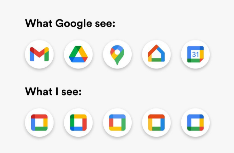
By now, we have all seen the meme (above) of the new Google suite of icons compared to rectangles in the same color palette, or Tobias Van Schneider’s tweet on the similarities of many tech icons being a real issue for users to cognitively manage. These point to an apparent problem that users face due to designers following the trend of highly saturated, multicolor icons. These design decisions have led to users having difficulty storing or organizing the visual information necessary to complete certain tasks.
So, how do we fix this problem? Of course, there have been many design trends in the past, and it’s nothing new. And while there has always been pressure for brands to stand out amongst their competitors in the space, never have brands had to weigh the consideration of one’s brand elements alongside another company whose product is nothing like yours but just happens to be in another tab in your browser or icon on your phone. So, while we don’t work for Google and lack any connections to improve the issue brought to us by Tobias, we thought we’d provide our take on a design approach that could be a better iteration of the Google suite of icons.
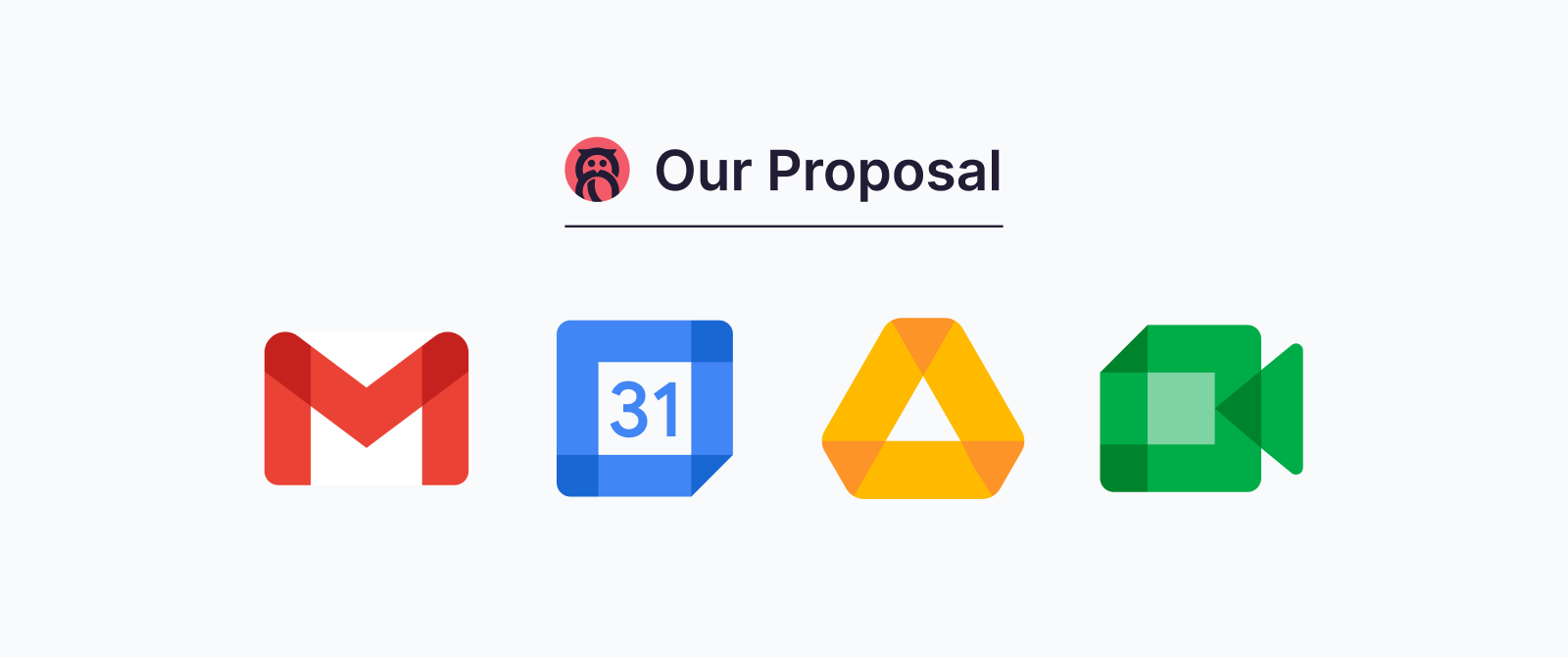
Our Take
When Google started to implement its newly designed icons the Savas team started talking about ways we could help revise and improve the design decisions of Google. We devoted time to talk about how we can learn from the user outrage that we’ve read on social platforms. We asked ourselves: “How can we learn from this?”
As a team, we used the cognitive load theory to rework the icons. It came down to this overuse of color that doesn’t help the user filter through information in the sensory brain, confusing both the working and long term memory — ultimately making it difficult for the user to complete their task.
The Icons
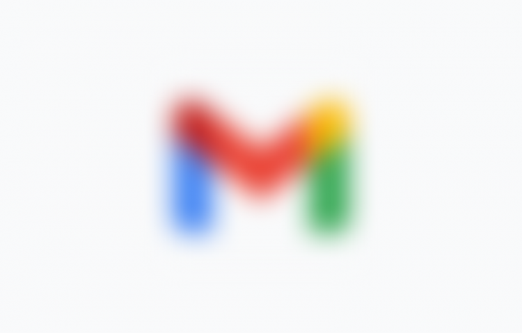
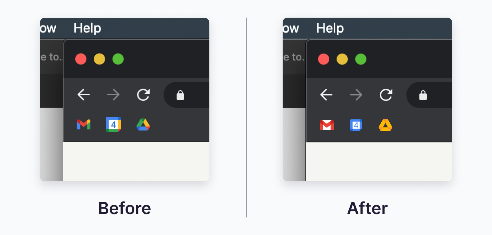
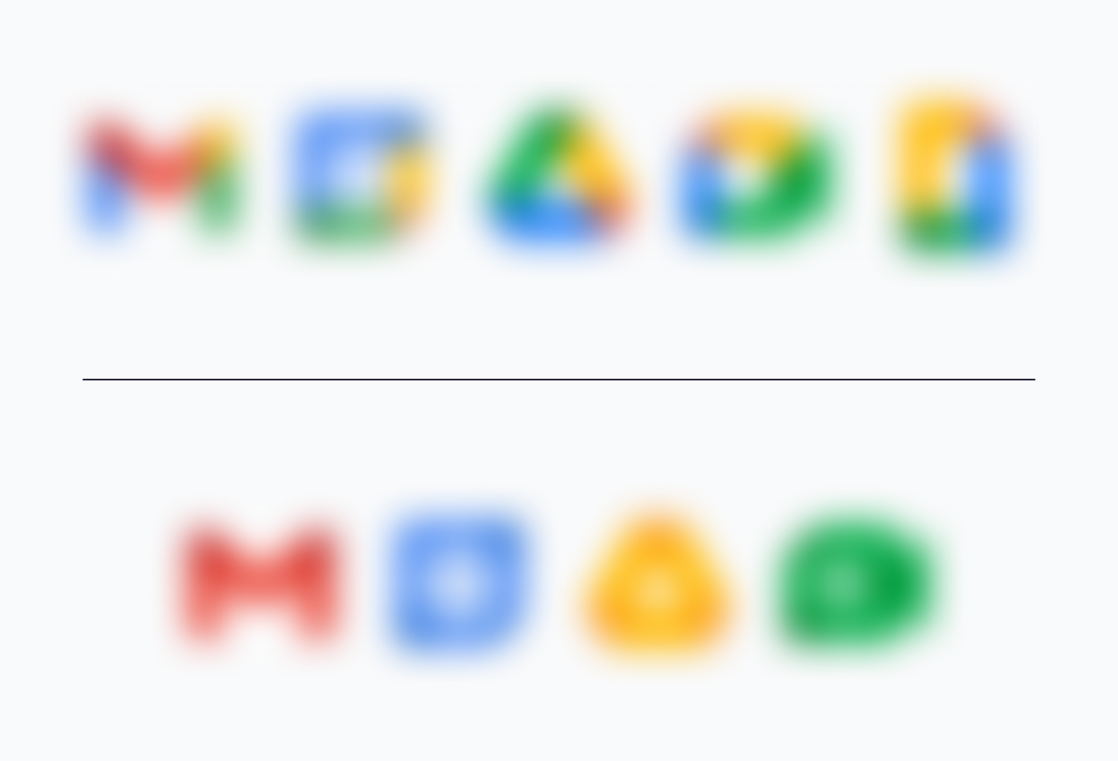
Icons can communicate branding but it’s far from their primary purpose. Icons are often paired with labels, but when they can’t be, the visual must be crystal clear. Here the structure of the icon doesn’t appear to be much of an issue. We’ve established the problem: too much color packed into too small of a space. We can simply reduce icons to identification by color, shape, or a combination of the two. Blurring the new icons demonstrates how if we remove shape, the mix of colors cannot function as a suitable identifier.
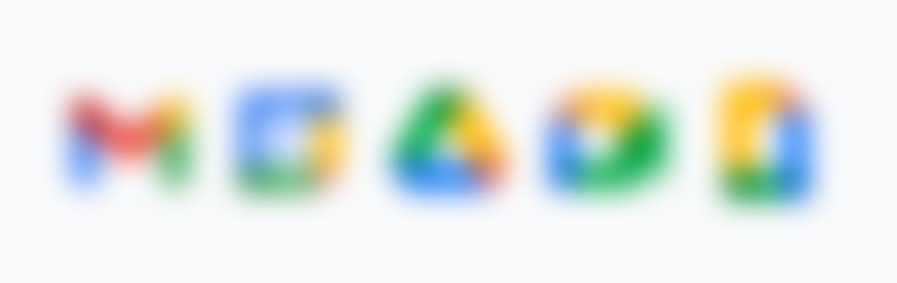
At a glance, it’s a muddled mess. The solution lies in something Google was already doing — identifying each product with its own color. Some products share the same color, but that’s where the structural difference of each icon comes into play.
That’s it. That’s the graphic.
Instead of adding more colors into each icon, We’ve chosen to keep the older, more familiar palettes, with some exceptions; we’ll get more into those in a bit. Google’s evolution of the icons apart from color is something commendable. Due to its massive reach, Google has the brand equity to take an abstract shape like the Drive icon and imbue it with meaning. They’ve done the hard work to associate the identifier with the product.
Challenges
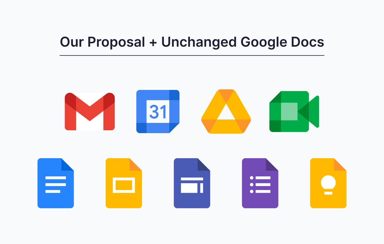
Docs
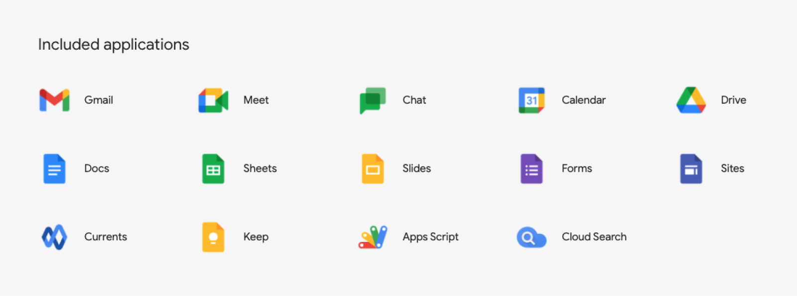
You’ll notice we didn’t include a Docs icon above. Weirdly enough, the new multicolored Docs icon doesn’t seem to appear on its own anywhere (see image below). Not even on the new Google Workspaces site. In the launch video, the component services that makeup Docs (Docs, Slides, Sheets, Sites, Forms, and Keep) slide up into the new icon. Why complicate an already-working system?
Each Docs icon is successful because it’s primarily one color. You can glance and see a yellow tab in a sea of blue and know that’s the Slides deck you need to finish up for that meeting in 15 minutes.
Wrapping Up
Cognitive load is real. Google and their suite of products are in a unique position where their various brand marks and icons have real daily impact on their users. This impact is evident from the outpouring of feedback on social media. Feedback that’s a bit different than the standard “resist to change” of rebranding a new logo, but one that’s rooted in daily interaction. And while we have little to no power to make our suggested change a reality, we felt compelled to share it with the world and get some quantitative and qualitative feedback. Perhaps the best way to do that might be a series of user tests to quickly find the appropriate icon? Maybe we’ll create a bookmarklet of our set to try out — but first we’ll need a little feedback: what do you think?