Accessible Visual Design

Drew Glover on background

Drew Glover

A styled error message signifying "0 errors"

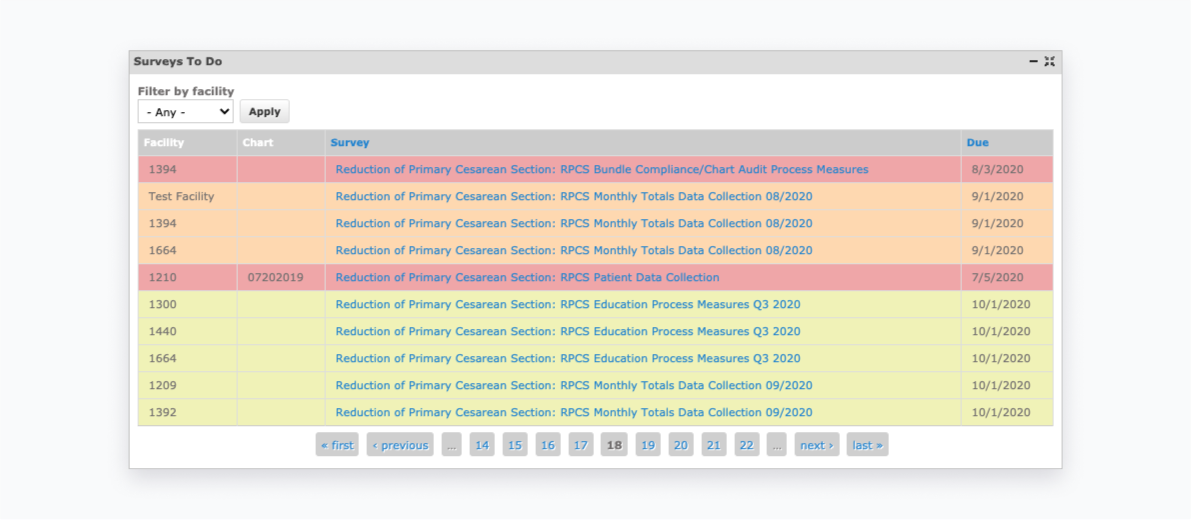
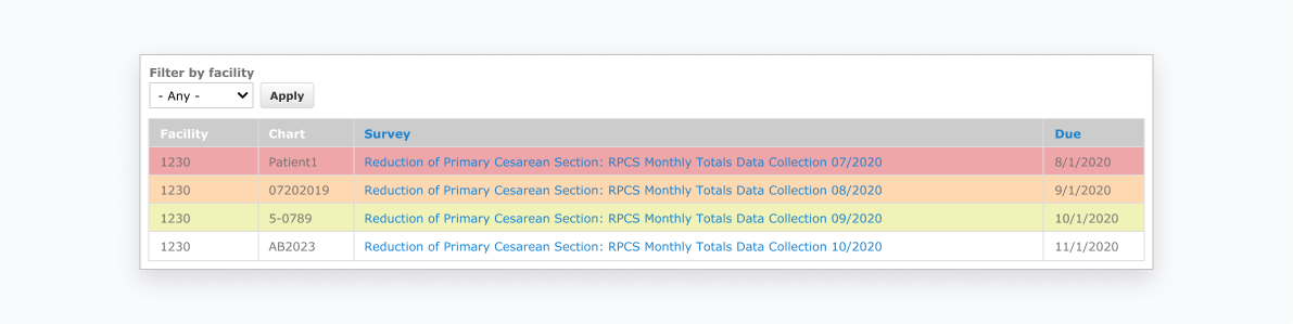
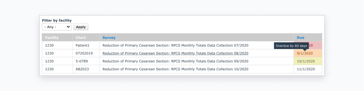
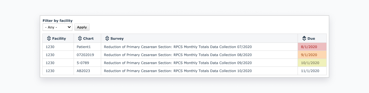
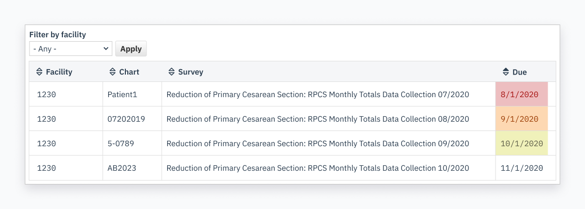
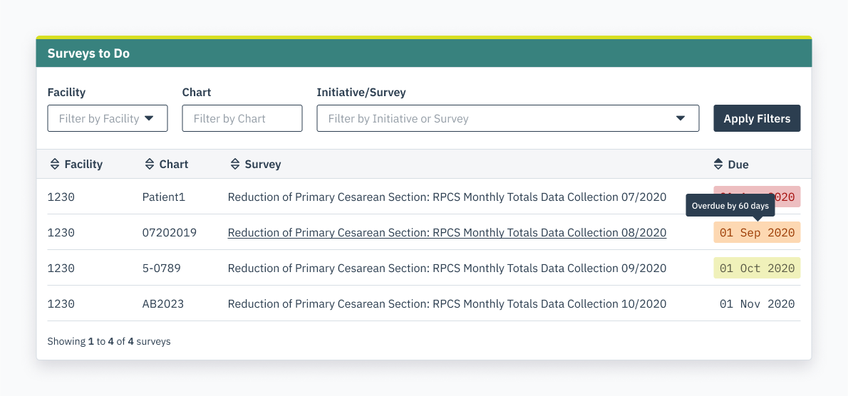
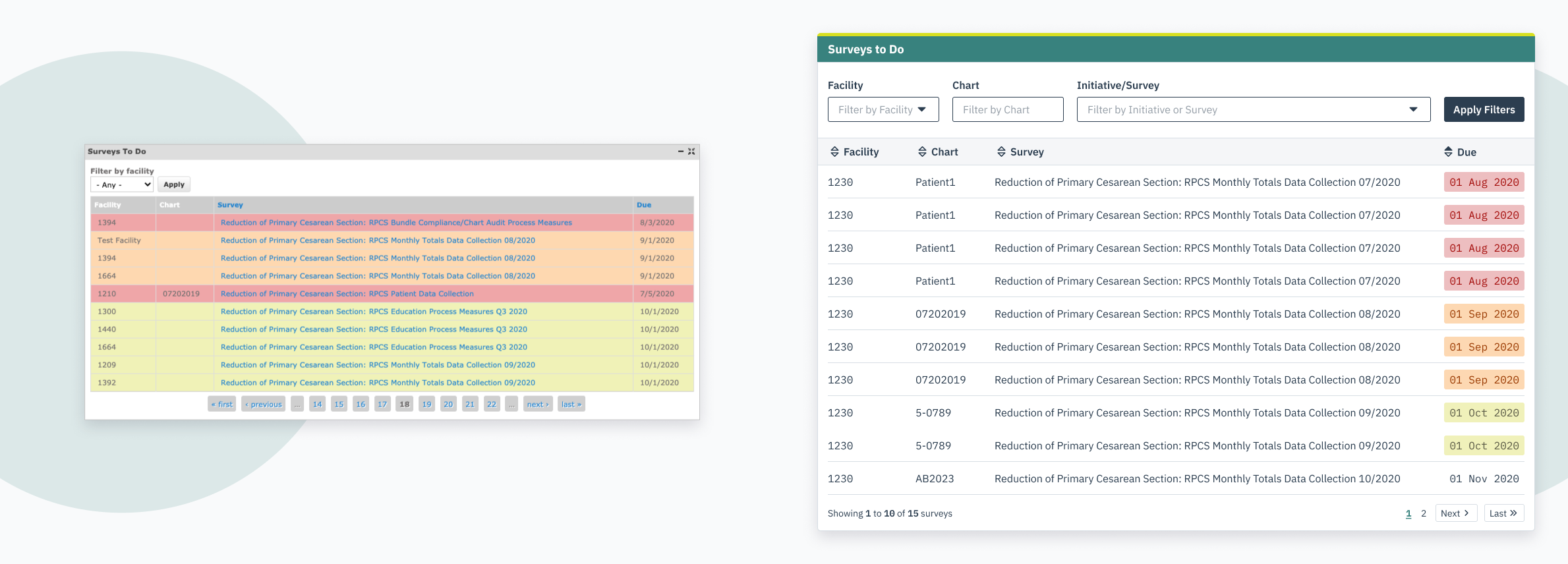
We recently gave PQCNC's DELPHI reporting tool an overhaul. DELPHI handles a lot of data, and we were delighted to have the opportunity to make it more usable.

While the UX audit we conducted focused on interaction, it goes without saying (saying it anyway, though ?) that good accessibility results in an inherently good user experience. It's not a matter of designing or thinking in terms of one or the other. Additionally, it's a myth (a well-disproven one, at that) that good accessibility means compromising on visual design. On the contrary, our approach to visual and user experience design directly supports both accessibility and usability.

Addressing the Basics

Data in DELPHI is mostly delivered in the form of tables. So, we can examine one of these tables in isolation to identify the key accessibility issues and a proper course of action to remedy them. Here's their original table design that we'll use as an example:

Isolated table from the PQCNC DELPHI dashboard.

Let's start by paring down this table to its core information. Using anonymized information, here are four rows illustrating the different possible states. This table lists requests for relevant patient information (surveys) that have not yet been completed by the user. The corresponding color represents how overdue each survey is. Yellow, orange, and red indicate 30 days, 60 days, and 90 days overdue, respectively.

Isolated table from the PQCNC dashboard with only four rows, each one representing a potential overdue status

To me, the most obvious issue here is contrast, manifesting in a few different ways. First, the survey titles. Each survey title is a link to its corresponding form to fill out and has a typical "link blue" color treatment (#1982D1). Against the white background, this treatment only reaches a contrast ratio of 4:07:1. When combined with the potential overdue status colors, contrast suffers further, falling well below the WCAG 2.1 required 4.5:1 ratio. We'll address this by:

  • Indicating links with an underlined hover state.
  • Including a tooltip over each due date.
  • Restricting the overdue status color to only to the Due column, and playing with HSB values to find an appropriate type color.
  • Changing the default font color to be darker and more robust.
Isolated PQCNC table with font color changes and hover states

Already, we've cleaned up a lot of visual clutter. For users who are familiar with the yellow/orange/red convention, they'll still be able to recognize it at a glance.

Clarity in Presentation

Next, the table header. Along with similar contrast problems, there are also usability issues. The same blue that was used for links is utilized in some of the columns, but signifies a different action; as clicking on a blue column header sorts the content of the table. We'll fix it by:

  • Bringing in the darker font color.
  • Adding iconography to indicate sorting functionality.
Isolated PQCNC table with icons denoting sorting in each data column

There isn’t a set minimum text size in the WCAG guidelines. However, studies conducted on digital text size and conclusively say that larger type helps increase reading speed and greater comprehension at a glance. We'll bump our type up to at least 16 pixels, the standard size of text in Chrome, Firefox, and other widely used browsers. We'll also begin to introduce a new aesthetic that emphasizes usability of the dashboard, consisting of:

  • Larger type size and IBM Plex Sans for all alphanumeric information.
  • Increased padding around text.
  • Utilizing IBM Plex Mono in numeric-only fields for alignment.
  • Increased whitespace around elements to improve the ability to scan information.
Isolated PQCNC table with a new and larger typeface, as well as more whitespace around text

Increasing Functionality

We started with only the ability to filter surveys by one field, Facility. Since we've made each column sortable, it's more useful if the user could also filter other fields. At this stage we'll:

  • Add relevant filters.
  • Remove visual clutter like vertical dividers, emphasizing the row entry as a whole.
  • Convert the overdue status into a contained indicator.
  • Increase the prominence and specificity of the filter button.
Isolated PQCNC table with additional filters

Finally, we'll wrap the table up with an aesthetic touch by adding the PQCNC brand colors and take a step back.

Isolated PQCNC table showing brand colors and final redesign

To Conclude

Design doesn't exist in a vacuum, and accessibility isn't optional; these aren’t just inspirational phrases, but words we live by as designers here at Savas. We're proud to include accessible design as a tenet of our design and development process. As you can see, accessible design guidelines were the building blocks for the transformation of this table design — we didn't work around them, they were used intentionally to cogently organize and display information for all users.

Side-by-side comparison of the original and redesigned DELPHI Surveys table